Web Design Industrial Average.
If Dow Jones' companies represent the overall market trends, then the companies which constitute it should reflect the overall web design trends. Is it so or isn't, let's investigate.
There are 30 companies currently in the Dow Jones Industrial Average index, and it is so for many many years and probably will stay that way. All of them have websites, of course. Some of these websites probably aren't aimed at the wide public. Sometimes it's more desirable to build a website for investors, or product buyers. Smart investors don't like to see too-shiny websites, because it immediately triggers the red light in their minds: he-ey!! this company spends too much money on unnecessarily relevant things, therefore the profit from investing in this company will unnecessarily be nice. So as we'll see, most of the companies build their websites in a somewhat conservative way.
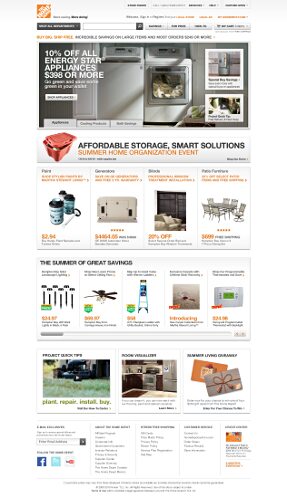
 Walmart's website is a brilliant example, by visiting their page you can find all the described above, and the genious declaration that's saying: We are saving people's money so they can live better.
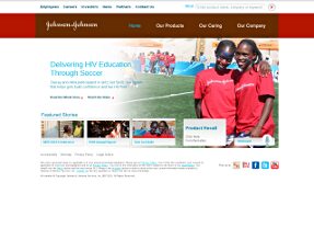 Johnson&Johnson is associated with healthy life products and so the website reflects this concept. The website is simple in usability, minimal in design, but rich in content that is relevant to the visitor. The colors aren't too rich.
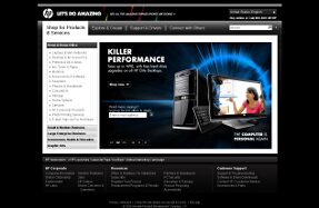 HP stands in the heart of the hardware market with great basket of products, like laptops, printers, and other hardware. The company as it looks has a deep understanding of buyer's expectations, they know that the buyer will visit their website and make his or her research before the buying. The design here is more "polished" and cool, and "professional" too.
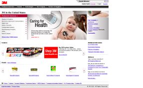 3M is a science company. I didn't really know, but I read it on their website. Good to know. The website looks easy to navigate, interesting and explaining. Who would refuse to the temptation of digging a little deeper to learn some more about them? :)
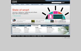 IBM has a highly informational website, so rich in content that if you were to read it all, you couldn't finish in this life. It looks good, but the content is more about the information itself as it seems. Again, if you're not a programmer or an investor, then you can contine enjoying our research.
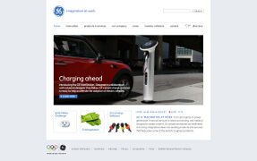 Do you know what is GE WattStation? It's also a greatly designed thing that will charge your or your children's vehicle with atmosphere-friendly - electric fuel! What can you say about the website when you love it?
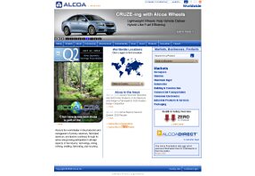
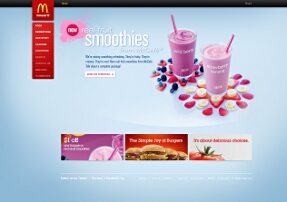
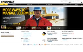
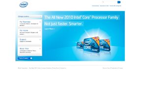
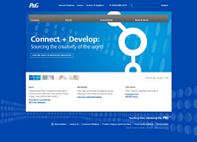
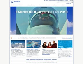
Let's enjoy the rest in a silent contemplation. To conclude it all, all of the websites emit some solidity, rigidity, stability (please complete the list). The color schemas are simple in most of them. There are exceptions as it should normally be. Personally, McDonald's' website is my favourite. It just looks more impressive. And information (or in-formation) is all about the form whether it's digital (texts) or analog (images), so both components are important in web design.
The patterns that connect these websites are: clarity, ease of use, illustration of associations, icons, shadows, gradients and other.
If we should learn from these, then I would emphasize one more invaluable pattern - simplicity of visual expression.


![]()