Ten great designs of 2010
Experienced web designers know that a great web design can be separated to three basic categories: Informational / Functional / Promotional, where Informational category is of course is of the foremost importance since it's primary. For this article however, it will be implied that if the main website's commodity is information then it's Informational, for example a news website, or any entertainment website like YouTube where the visitor in a relaxed or passive state of mind can be instantly updated on what's going on in the World. The other category is Functional and it's primary commodity is functionality. It's an 'active' content, where a visitor can interact with machine, or another human by playing a game, or chatting or building a 3D world etc. Other examples for the Functional category include: calories calculators, online shops, online games, governmental organizations, or search engines. Third category is Promotional - it's about promoting products, or services or other websites etc. Promotional websites usually have more 'kick-ass' look, they resemble the magazines' advertisements, usually have minimal informational content, maximal emotional influence and some functionality to collect information about the potential client. So what do all of these have in common? Let's omit the commercial part and try to find the general rules, the patterns that connect between these web sites, to allow us to build our own mental 'sketch' or generalized view. This will be the cornerstone for the creative thinking in patterns. For the sake of simplicity, let's observe a slice of two categories with websites which have been chosen mostly by their belonging to the Promotional (more) and Informational (less) categories.
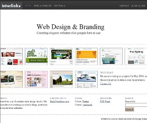 They are all very popular, light and easy to navigate. Just like with the rest - a great informational website should provide as much info as the visitor needs and not more! The simplicity is also the key to a successful cross-browser design in most cases. White or monochrome backgrounds are always successful, since colors look very differently on different monitors. Colors in web design is a separate science - a friend of mine, a beginner designer, has spent many days and nights on some 'web-safe' color schema, just to find the other day that they are very ugly-looking on his family's computers.
Small colorful icons are these commonly ignored eye candies. Their primary purpose is to make the website navigation easy but in design, they are sometimes left consciously unnoticed. They are certainly another hallmark which separates a great web site from a mediocre one. Usually, they are simply looking but even a small arrow on a colorful background can make a big difference! Not very rich in colors these can be created in different vector graphics software, like Fireworks or the free and great Inkscape. Vector icons are pretty easy to create, they are also flexible and resolution-independent. Inkscape has also so-called spiro curves which are amazing.
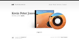
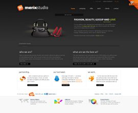
None of these websites suffer much from fear of empty space. It's o.k. not to load the whole page with graphics just as it's ok to aim only to the middle of a target. Our eyes will find what they seek, and it will be even more easier if the designer will help by providing only the relevant content. So what's the best filling for emptiness? The web site's main background color is great! White color is most commonly used, since our culture implies writing with black on white. Another possibility is to use gradients. And gradients are those simple elements, which are so common in professional websites. Despite the minimal effort in their creation, they add so much to the whole 'eye-candiness' even if the difference between two colors of a gradient is measured by the smallest distance in your favorite color picker!
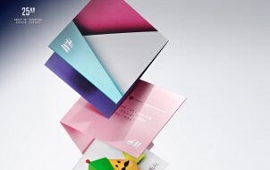
3D graphics are great for web. The easiest to make 3D graphics are of course photos. 3D can enormously enrich the web content, providing some content to a visitor which is closer to the world we live in. There are five major components for successful 3D - shape, light, shadows, colors and the general composition. For great 3D it's not required to have an expensive software, you can make 3D in 2D software, or draw it yourself and then transfer to the computer. Again, 2D Inkscape allows one to create amazingly looking 3D images. The other amazing 3D free program is Blender but it requires some time to learn, however the outcome of it can be astonishing!
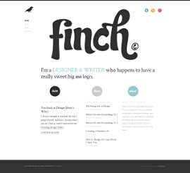
Unique and beautiful typography is another vivid implementation of the principle: the more important than what you say is how you say it. There is a plenty of free amazing fonts online, that constantly dream to be picked up and used somewhere! You can write the phrase i love web design with different fonts and feel the changing difference of it's meaning. Then you can play with the distance between the letters, lines, change from capitals to lowercase, place words vertically etc. The modern browsers already support font embedding directly in CSS, but for compatibility you can still use Cufón or other methods.
It's important to find your own unique style. And it's important not to follow any standards in web design but to be creative. It's more important to 'feel' the design instead of creating a layout as it 'should' be by prescription of some 'guru'. You like what you like because it feels great to you. It's the inner 'ok' and you can say it 'looks' great, or it 'sounds' great whatever, when you got this simple but important principle then you've got it for ever!
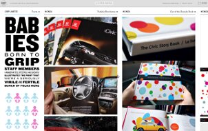
Sometimes professionals divide the page into two or more parts, where one part has a little bit different meaning than the other and drives more attention from the visitor. One part can be more Promotional and the other more Informational, to create together another 'dimension', just like two eyes together create the feeling of depth. This enriches the web content when used wisely, and the outcome effect is richness, uniqueness, professionalism, etc. You can see this pattern on different websites, and someone called it web-2 design, in short it looks great.
Finally, let me emphasize the importance of simplicity. A visitor should't learn how to use the website. There are plenty of websites that ignore this principle, and create weird buttons, or html controls so the visitor has to guess that in order to advance to the next page, he must first finish a Ph.D. And nobody likes this. The simplest and easiest form of a link is a colorful and underlined text. The simplest and easiest navigational menu is on the top. Why? Because it describes the site's main content categories, and it's the first thing a visitor will see when the page is loaded.
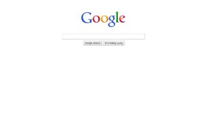
So, to summarize, we have seen different great web site designs that have in common most or all of these principles. Now, with all that in mind, I hope it's easier to understand why Google looks like Google, and not a fashion magazine. This is of course a highly Functional webste, so everything there is suited accordingly.
I hope you enjoyed this article, and thanks for reading! You can share your thoughts or comments below.