Logo Design Prototyping for a Social Network
Published on
Aug 31, 2014
Fast design prototyping is the only way to keep afloat in the sea of competition. So unless you have unlimited budget, the best strategy is to work it fast and in a convincing manner. The success of the presentational transmission shouldn’t be perfect, but it must surpass some minimal and acceptable perceptual threshold - namely the “feeling”.
Same approach can be applied to the vast majority of web projects such as magazines, blogs, promotional pages and of course to social networks. One example created by our group is bringerr.com. It’s [EDIT: was] a social driven network of delivery and moving services which was built to reduce the cost of transportation and generate the real or “market” value on the arena.
In addition to main functionality we created a simple responsive design suitable for most of our targeted devices. The prototyping went on using open source software such as Inkscape, Gimp and Google Chrome on Ubuntu Linux box using Dell Sputnik (another codename for DELL XPS), which is a great machine for web development.
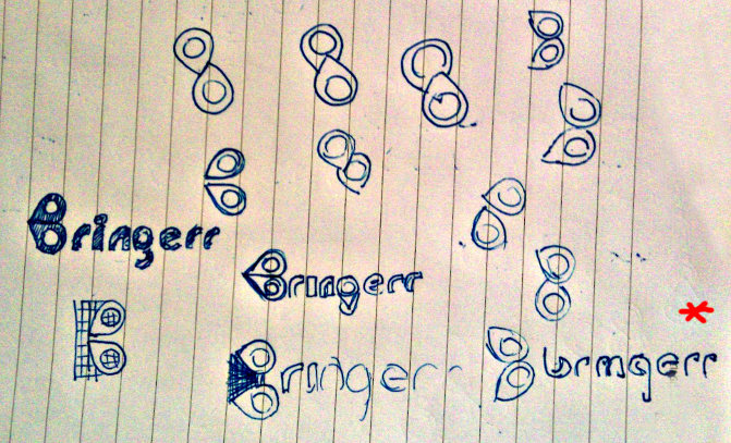
So the journey starts from an idea. The logo had to be about moving and transportation. But how can one represent such a vague and abstract term and digitize it into some intuitive symbol? One could visit thenounproject.com and search for “delivery” or “transportation” and find the expected: cars, delivery men and similar icons. But making a logotype from such a popular and raw material would make it look “cheap” and unoriginal. Instead, the author went on experimenting.
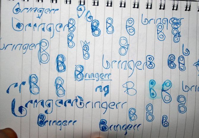
The name “Bringerr” is about bringing and moving anything, anywhere. So naturally one could start from drawing the interrelated idea cloud, but I started from drawing the logo. Drawing logo is a good approach when you want to find the “invisible” inside the given shapes of the letters. There’s a nice article about Seeing the negative in everything, which is a subcategory of what’s described here briefly.
First, I opened the GIMP and put together the letters, played with the fonts, and after half an hour found the font I wanted. As you know, there are many popular logos, and most of them use already available fonts created by someone else. It’s very tempting to create your own identity and style through your own font, even if you’re not actually building a new set of all 26 x 2 letters, but time is running, and probably on the early stages an existing font is the best choice. Just choose the right one. I found my free font on Google fonts, the name is Petrona and it looks like that:
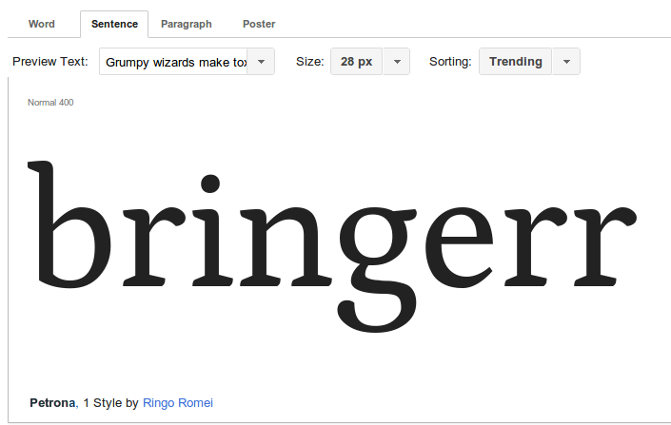
So the font was nice, but the creative process can be sometimes somewhat painful especially when you don't feel it's going anywhere. So I felt somewhat stuck, but since the Bringerr project has a vast database of things to be done including all kinds of full-stack development issues, I put the task of creating the logo aside and returned to my daily routine, keeping aside pen and paper for the logo ideas as they become available. I tried to devise a logo with a new font, breaking my own rules about time economy. And although I really found the font I wanted more than what I found on Google, I decided that developing that font into a final project would cost me more time than if I stick to the chosen one. So "Petrona" was it. The only thing remained was to create an icon for the logo.
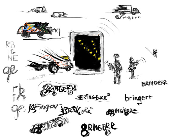
There are many kind of logotypes, some are completely iconic (3M, McDonalds, a lot of car companies such as Toyota, Audi, BMW and many more) and others are text-based like (Microsoft, Diesel, Virgin etcetera). So like Microsoft, which has the textual logotype and an iconic one, I also decided that we need an icon, right? Nahh, the real reason is of course to create a visual identity which is easily recognized. And since I was tired of text manipulation, and placing exclamation marks above ‘i’s etc, I started experimenting with an icon.
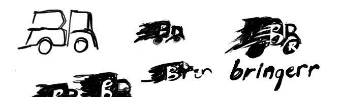
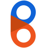
The development went on until realizing the similarity of the balloon form to the the shape of the letter “B” and that was it! Because the purpose of the social network is to basically connect or “meet” the two points - the source and the destination of the delivery, and to achieve that by combining it with the meaning and the purpose of the name itself. Also the goal is not to make it out of mainstream symbols, and not to use mainstream techniques. And the more it’s unique - the more convincing it is. Of course you are more than welcome to write your thought and suggestions below, but please keep in mind, that the goal was not to create a perfect logo, but rather a quick prototyping with a unique visual identity.
The final product was a no-brainer since everything was ready, and the only thing to do was to draw a few vectors, choose the colors and enjoy the result.
Thanks for reading.
Same approach can be applied to the vast majority of web projects such as magazines, blogs, promotional pages and of course to social networks. One example created by our group is bringerr.com. It’s [EDIT: was] a social driven network of delivery and moving services which was built to reduce the cost of transportation and generate the real or “market” value on the arena.
In addition to main functionality we created a simple responsive design suitable for most of our targeted devices. The prototyping went on using open source software such as Inkscape, Gimp and Google Chrome on Ubuntu Linux box using Dell Sputnik (another codename for DELL XPS), which is a great machine for web development.
So let’s start a discussion about logo development.
So the journey starts from an idea. The logo had to be about moving and transportation. But how can one represent such a vague and abstract term and digitize it into some intuitive symbol? One could visit thenounproject.com and search for “delivery” or “transportation” and find the expected: cars, delivery men and similar icons. But making a logotype from such a popular and raw material would make it look “cheap” and unoriginal. Instead, the author went on experimenting.
The name “Bringerr” is about bringing and moving anything, anywhere. So naturally one could start from drawing the interrelated idea cloud, but I started from drawing the logo. Drawing logo is a good approach when you want to find the “invisible” inside the given shapes of the letters. There’s a nice article about Seeing the negative in everything, which is a subcategory of what’s described here briefly.
First, I opened the GIMP and put together the letters, played with the fonts, and after half an hour found the font I wanted. As you know, there are many popular logos, and most of them use already available fonts created by someone else. It’s very tempting to create your own identity and style through your own font, even if you’re not actually building a new set of all 26 x 2 letters, but time is running, and probably on the early stages an existing font is the best choice. Just choose the right one. I found my free font on Google fonts, the name is Petrona and it looks like that:
So the font was nice, but the creative process can be sometimes somewhat painful especially when you don't feel it's going anywhere. So I felt somewhat stuck, but since the Bringerr project has a vast database of things to be done including all kinds of full-stack development issues, I put the task of creating the logo aside and returned to my daily routine, keeping aside pen and paper for the logo ideas as they become available. I tried to devise a logo with a new font, breaking my own rules about time economy. And although I really found the font I wanted more than what I found on Google, I decided that developing that font into a final project would cost me more time than if I stick to the chosen one. So "Petrona" was it. The only thing remained was to create an icon for the logo.
There are many kind of logotypes, some are completely iconic (3M, McDonalds, a lot of car companies such as Toyota, Audi, BMW and many more) and others are text-based like (Microsoft, Diesel, Virgin etcetera). So like Microsoft, which has the textual logotype and an iconic one, I also decided that we need an icon, right? Nahh, the real reason is of course to create a visual identity which is easily recognized. And since I was tired of text manipulation, and placing exclamation marks above ‘i’s etc, I started experimenting with an icon.
The development went on until realizing the similarity of the balloon form to the the shape of the letter “B” and that was it! Because the purpose of the social network is to basically connect or “meet” the two points - the source and the destination of the delivery, and to achieve that by combining it with the meaning and the purpose of the name itself. Also the goal is not to make it out of mainstream symbols, and not to use mainstream techniques. And the more it’s unique - the more convincing it is. Of course you are more than welcome to write your thought and suggestions below, but please keep in mind, that the goal was not to create a perfect logo, but rather a quick prototyping with a unique visual identity.
The final product was a no-brainer since everything was ready, and the only thing to do was to draw a few vectors, choose the colors and enjoy the result.
Thanks for reading.